Golden ARC Award Winner: Collateral/Literature Riverbend Wagu Brand Guide
Posted by: admin on December 22, 2021
Posted in: Newsletter
Provided by AC&C Marketing
 Many rivers flow through Siskiyou National Forest, where Riverbend Wagyu calves are born. These waters bring to life the streams, lakes and meadows that nourish the Riverbend herd. Even the Dutch last name of the brand’s founders – the Kuykendall family – translates to “View of the Valley.” Paying homage to this special region and its unique waterways was essential to this brand. Riverbend Wagū partnered with AC&C Marketing to cultivate a name and brand identity that authentically communicated Riverbend’s founding and setting.
Discovery and takeaways
In preparation for this brand guide tactic, AC&C completed a discovery process, which included interviews with the Kuykendall family and a competitive audit of the Wagyu beef industry where they considered both adjacent and aspirant competitors. The market was comprised of brands ranging from artisanal to mass market and from conventional to sustainable beef, and they identified the space where Riverbend could be most successful – as one of the most sustainable Wagyu beef offerings that was also artisanal.
This market opportunity takeaway from discovery carried into AC&C’s telling of the Riverbend story via impactful visual language. Photography and video featuring natural lighting, full landscapes and the entire herd would touch on traditional, artisanal notions of raising cattle. AC&C led an extensive two-day video shoot capturing the herd being driven across the valley. Lush imagery of the Riverbend region would be key to creating the setting and reminding the consumer of the sustainability of smaller, more intentional operations.
Resonating with a discerning target
For the B2B target customer segment, AC&C focused on restaurant chefs and owners. This segment would be made up of those who prioritized quality, location and taste, sought locally sourced ingredients and pursued food partners with deep marketing stories. The key demographic would be mid-to-upper income, higher-educated, farm-to-fork restaurant clientele. The Riverbend brand would capture those who were trying to find good-quality and great-tasting meat that could be sourced locally. This customer would research local sources and believe in paying more for the right products, often wishing there were better options of beef with adequate marbling. The needs that drove this chef or owner would be sustainability, quality, taste, proximity and seasonal availability.
“The Sustainability Seeker” was established as the target customer segment. This customer would seek products made close to home and fresh, especially prioritizing wellness, animal welfare and environmental sustainability. This type of person was likely trying to limit red meat to once or twice a week for health or sustainability reasons. In their pursuit of the best meat, this customer would research local sources, pay more for the right products, seek out sustainable meat at all the places they shop, shop at specialty e-commerce sites and likely feel frustrated that meal kit and grocery delivery options didn’t meet their standards. To meet their needs, Riverbend would have to be local to this customer, offer sustainability (especially in shipping and packaging), transparency and carbon footprint management.
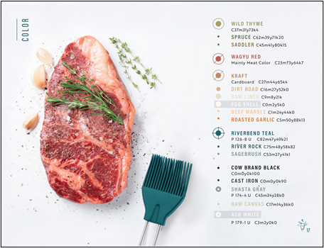
Constructing a visual language
Riverbend Wagū’s brand guide is the culmination of AC&C thinking through Riverbend’s founding story, physical setting, market opportunity, ideal customer personas and potential key touchpoints. The guide itself establishes brand history, voice and tone, along with a supporting visual identity. It provides guardrails for logos, colors, typography, photography, textures and patterns in various contexts. Even case uses for promotional assets, packaging and point-of-sale display art are included to give sufficient scaffolding for the user.
The strength of Riverbend Wagū’s brand guide lies in the brand recognition it creates, the quality control it ensures for case uses and the comprehension its design provides for viewers. In the case of Riverbend Wagū’s website, there is clear comprehension, consistency of the brand and a recognizable, wide-open feeling for users.
Recent Posts
January 16, 2024
Stratovation Group is hiring!


January 26, 2024